On task 1 we had to draw portraits of class members, we had to do it in various styles such as having to draw with your opposite hand, draw without taking your pen off the paper, draw a certain expression, focus on the person's smile and more. This was to test different styles of drawing, also we used biro pen and pencil as well as colours to experiment.


Task 2 we had drawn self-portraits, this was of different expressions: angry, smiling, excited, surprised, gloomy and sticking the tongue out. By doing this we learnt how to draw different features on the face, such as a tongue which wouldn't be visible during a normal portrait. These portraits were all sketches and done on a single piece of paper. As you can see on the image below I need to improve by doing the structure of the face (for example it looks like I have gained weight on a few of the pictures) to improve this I could start by drawing the features of the face such as the eyes, nose and mouth. Then work my way outwards to then the structure of the face. This is because I always allow too much space for features, hence the reason why I look like I have gained weight on some of the sketches.

In Task 3 we drew anime expressions, these were happy and embarrassed. We used a tutorial from YouTube to draw the expressions. This tutorial showed how to draw in a manga style, such as the eyes and how to use eyebrows to represent an expression. Also, I learnt how to use shading of a pencil to show colour in hair and shading on the cheeks to show expressions. I could improve on these drawings by trying to add more of an expression on the "embarrassed" face.

In task 4 we used a grid to draw a parkour image in detail, both images had the grid so we could draw accurately. The reason why this is good is because we could draw in more detail by focusing on the certain boxes. We could also add our own colour to the design as you can see below. I could have added more colour to the image so it is deatiled like the original image.

In task 5 we had been given a template of a human figure and instructions on different body parts to put onto the human figure. This included crab claws, bird feet, peacock head, human abs and cheetah legs. This is to create a mythical creature, we were able to select what images from google we wanted to use, we could also colour the creatures and add tones to it.

Task 6 was to draw expressive hands, these hand gestures were peace, okay sign, flat hand and clenched fist. The purpose for this was to draw various details on our hands and to draw the various positions. I could have added the detail such as creases and blemishes to the hands.

Task 7 we had to trace three different stances from combat; these were two attacks (light and strong) and then a block stance. These pictures were off us and we had them taken of us with a sword and shield then we had to trace over them for pictures.


In Task 8 we had top draw silhouettes with various different colours. To do this we needed to draw objects around the person, which would reveal the outline of the person and what they are doing. We could not draw around the person outline and we had to colour in the background, using different colours to represent various objects. We had to do 8 different drawings of this. To improve on these drawings I could have added a variety of colour schemes to the drawings so it looks less repetitive.


Perspective.
Exercise 1 was an introduction to 1, 2 and 3 point perspective, as well as isometric drawings.
Isometric

One point

Two point

Three point

Exercise 2 was a space station drawing using two point perspective. To improve the space station I could have added more detail to the drawings, as well as this next time if I do this then I should be more careful where I put my hand due to the smudge on the paper.

Exercise 3 was crating exercises, making various shapes within a cube.


Exercise 4 was to create a pistol using 2 point perspective and a physical pistol as inspiration for the drawing. away to impove the drawing is to add more of a complex design to the gun because it looks like a simple design for a twp point perspective.

Colour
Exercise 1 was an introduction to colour, using both primary colours and a cross hatching technique. Creating a colour wheel where tertiary and secondary colours were mixed with the cross hatching technique.

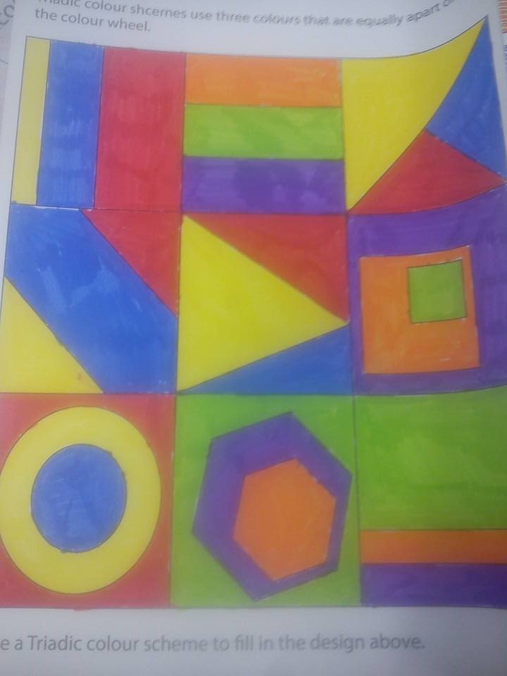
Exercise 2 was colour schemes, we had to use analogous, complementary and triadic colour schemes to colour in the words.


Ideas Generation.
Exercise 1 was to draw various different uses for a clothes peg, for example making the peg into a crocodile. Improving this drawing would mean that I should be more creative with the peg, making more animals with it and using more than one peg for the drawings.

Visual Communication
Exercise 1 was to draw a how-to-guide, step by step, to do or make something. Mine was a fly trap and we had to do it purely through visual steps with no words.

Objects
Exercise 1 was to study various paper tones, we had to draw a piece of paper in different forms; in a knot, twisted, curled and folded. To improve this drawing I could have made some of the individual drawings bigger so you can see more detail.

Textures
Exercise 1 was to use oil, soft and charcoal pastels to show different textures of materials, these materials were drawn from direct observation. I could have used a variety of pastels so the textures and drawings are more clear.

No comments:
Post a Comment