Primarily, I researched my character Jonathyn who was a pirate as well as a thief set in medieval times. He is in a dungeon and there are signs of torture nearby. For the research, i went through Google and looked at various images of pirates and their surroundings to get a better idea of how to style him. As well as this I watched films such as Saw so that I could get ideas for different types of torture/interrogation devices that I could put in the dungeon to make it seem very dark and creepy. Also, i wanted to get different weapons in there compared to what would have been used in those times so I got some eccentric weapons from google to use for the research. Furthermore, I wanted the appearance of the character to be unique, so I used a half skull design for a mask and used Edward Kenway from the AC series for the hair.
When I was designing the various items I used exploration techniques for different designs, so I could see which would fit the character best. Some guns/swords looked too much like they are for knights rather than a pirate.
To improve on Jonathan I could have watched more pirate related films to see how a variety of them dress and act, then I could have designed the clothes relating to how a thief would be even with the vibrant colours needed.
During the exploratory stage, I tested out various designs that would suit the character. However, I wanted eccentric designs for him due to his eccentric look si I researched absurd guns that would fit him. In the end I came across a shotgun and attached an axe to the under barrel so that it would match the characteristics of jonathyn, as well as this the sword looks like a high-class sword for a pirate which relates to his thievery (he stole the sword) and fits him as it is sleek and would allow him to be agile. To improve upon these weapons, I could have added more detail to the weapons such as blood to represent death from these weapons. Also, I could have found a way to incorporate these with the character design body. The cards he carries are the Joker, King and Queen, these cards have a simple design so that they are not over complicated due to it being medieval times a lot of features like this were simple so it was easy for everyone to understand. However, I could have improved this by adding an eccentric design to match the character and his equipment, the cracks on the cards have shown the use over a long period of time and that they are starting to wear out. Personally, the most important piece of the concept art was the character himself. I made sure his clothes were over the top with bright colours (as requested) and that he had an extraordinary mask on to match his character. the clothes represented both high ranking officers during this period and a standard pirate, the gloves he wears are so that he can conceal items within the gloves but to match his thief style they are fingerless. Half of his face is concealed by a steampunk skull, designed to conceal his identity and give an eerie feel about the character (making him, therefore, more mysterious). In addition to this, the other half of his face reveals what appears to be an ordinary eye. My reason for adding this in was to make the character appear subhuman due to his thieving habits (making him appear like a bad person). His bushy beard and shabby hair show the pirate within him, showing that he has been away from land for a long time and him ahs not been able to shave so his facial features have grown out of control. To improve on this drawing, I could have added more feature to the non-masked side of his face, these features could be scars and gashes showing wear and tear to his skin over the years so it doesn't look as clean as it does. My reason for adding minimal colour to these images, even though this is the approval stage, is to show the drained life from the character and the setting (apart from his vibrant clothes).
Friday, 9 December 2016
Task 3
Here are the finished drawings and ideas for the concept art this includes the room which includes the torture chair. I have done the sword and pistol separate due to them being too small to put on the pictures with the character or in the room, as well as this it also means there can be more detail on the weapons then. I did the same with the cards.


Task 2
Task 2- Exploratory stage of the drawings
During this stage, I had to explore various ways of each feature to find which one looked best. also, I used various images to inspire my drawings for the final images of the drawing. I only did the exploration stage for the weapons and the cards because I had an idea solid in my head for the face and the character itself, however, I will show the images that inspired the drawings.


 https://beagamecharacter.com/2014/04/18/the-skills-of-edward-kenway/
 http://tdcdecals.com/Half-Skull-Vinyl-Decal-Sticker-P1786313.aspx
 http://www.halfblogre.com/2011/08/flintlock-firearms-4e-1600-1830/
 http://brethrencoast.com/Pirate_Weapons.html
 http://www.replicaweaponry.com/denix-17th-century-german-replica-axe-pistol.html

During this stage, I had to explore various ways of each feature to find which one looked best. also, I used various images to inspire my drawings for the final images of the drawing. I only did the exploration stage for the weapons and the cards because I had an idea solid in my head for the face and the character itself, however, I will show the images that inspired the drawings.


 https://beagamecharacter.com/2014/04/18/the-skills-of-edward-kenway/
 http://tdcdecals.com/Half-Skull-Vinyl-Decal-Sticker-P1786313.aspx
 http://www.halfblogre.com/2011/08/flintlock-firearms-4e-1600-1830/
 http://brethrencoast.com/Pirate_Weapons.htmlhttp://www.replicaweaponry.com/denix-17th-century-german-replica-axe-pistol.html
Friday, 2 December 2016
HA2- Concept Art Process
Exploration Phase
The exploration stage is the first stage of the concept art process. These drawings are usually quick and simple and focus on separate pieces, such as body parts and weapons. Very rarely these drawings have colour or any extreme detail due to the fact that they need to have multiple drawings within rapid succession. However, shading is needed to have some detail on the character. But the main focus of the exploration stage is quantity over quality, developers would rather have 50 drawings of a character rather than 2 detailed drawings.


Approval Phase
The approval phase is the second phase of concept. This is where the first phase of concept art is improved upon by adding colour and extreme detail. The second phase is extremely important because these drawings are shown to publishers to help pitch the game as well as the characters and levels. In the worst scenarios, if the game itself doesn't appeal to publishers then all of the work will be discarded and no longer used within that project but could possibly be used within other projects. This phase is never released to the public initially but can be done in the future, and is only specifically shown to the publishers confidentially.


Promotion Phase.
This phase is the final phase of the concept art. This phase only occurs after the game is given the greenlight by the developers and the game can be produced. This style of concept art includes the most detail than any other phase because these pieces of art are used to promote the game itself. It can include the environment, characters and objects, sometimes all three can be used in a single image. They are usually used in one image for posters and can be given to journalists to help promote the game. The best of this concept art are used also by publishers, to help promote a "hype" for the game, usually these can be scenes of action or important scenes for the game itself.


Images:
Exploration Phase-
https://blogs.unity3d.com/2015/06/15/making-of-the-blacksmith-concept-and-art-production/
https://uk.pinterest.com/explore/character-concept-art/
https://uk.pinterest.com/szisszmok/concept-art-thumbnails/
Approval phase-
https://uk.pinterest.com/pin/376824693798836724/
https://uk.pinterest.com/pin/420101471464078511/
https://uk.pinterest.com/williamsimpson4/future-vehicles-and-life/
Promotion Phase-
http://conceptartworld.com/news/batman-arkham-city-concept-art/
http://conceptartworld.com/news/the-last-of-us-concept-art/
https://www.reddit.com/r/CODZombies/comments/4nk96r/cinema_of_the_dead_concept_map_for_bo3/
Friday, 23 September 2016
HA1 Task 1 - Mark-making Portfolio
On task 1 we had to draw portraits of class members, we had to do it in various styles such as having to draw with your opposite hand, draw without taking your pen off the paper, draw a certain expression, focus on the person's smile and more. This was to test different styles of drawing, also we used biro pen and pencil as well as colours to experiment.


Task 2 we had drawn self-portraits, this was of different expressions: angry, smiling, excited, surprised, gloomy and sticking the tongue out. By doing this we learnt how to draw different features on the face, such as a tongue which wouldn't be visible during a normal portrait. These portraits were all sketches and done on a single piece of paper. As you can see on the image below I need to improve by doing the structure of the face (for example it looks like I have gained weight on a few of the pictures) to improve this I could start by drawing the features of the face such as the eyes, nose and mouth. Then work my way outwards to then the structure of the face. This is because I always allow too much space for features, hence the reason why I look like I have gained weight on some of the sketches.

In Task 3 we drew anime expressions, these were happy and embarrassed. We used a tutorial from YouTube to draw the expressions. This tutorial showed how to draw in a manga style, such as the eyes and how to use eyebrows to represent an expression. Also, I learnt how to use shading of a pencil to show colour in hair and shading on the cheeks to show expressions. I could improve on these drawings by trying to add more of an expression on the "embarrassed" face.

In task 4 we used a grid to draw a parkour image in detail, both images had the grid so we could draw accurately. The reason why this is good is because we could draw in more detail by focusing on the certain boxes. We could also add our own colour to the design as you can see below. I could have added more colour to the image so it is deatiled like the original image.

In task 5 we had been given a template of a human figure and instructions on different body parts to put onto the human figure. This included crab claws, bird feet, peacock head, human abs and cheetah legs. This is to create a mythical creature, we were able to select what images from google we wanted to use, we could also colour the creatures and add tones to it.

Task 6 was to draw expressive hands, these hand gestures were peace, okay sign, flat hand and clenched fist. The purpose for this was to draw various details on our hands and to draw the various positions. I could have added the detail such as creases and blemishes to the hands.

Task 7 we had to trace three different stances from combat; these were two attacks (light and strong) and then a block stance. These pictures were off us and we had them taken of us with a sword and shield then we had to trace over them for pictures.


In Task 8 we had top draw silhouettes with various different colours. To do this we needed to draw objects around the person, which would reveal the outline of the person and what they are doing. We could not draw around the person outline and we had to colour in the background, using different colours to represent various objects. We had to do 8 different drawings of this. To improve on these drawings I could have added a variety of colour schemes to the drawings so it looks less repetitive.


Perspective.
Exercise 1 was an introduction to 1, 2 and 3 point perspective, as well as isometric drawings.
Isometric

One point

Two point

Three point

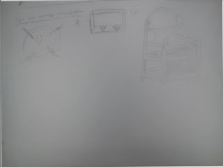
Exercise 2 was a space station drawing using two point perspective. To improve the space station I could have added more detail to the drawings, as well as this next time if I do this then I should be more careful where I put my hand due to the smudge on the paper.

Exercise 3 was crating exercises, making various shapes within a cube.


Exercise 4 was to create a pistol using 2 point perspective and a physical pistol as inspiration for the drawing. away to impove the drawing is to add more of a complex design to the gun because it looks like a simple design for a twp point perspective.

Colour
Exercise 1 was an introduction to colour, using both primary colours and a cross hatching technique. Creating a colour wheel where tertiary and secondary colours were mixed with the cross hatching technique.

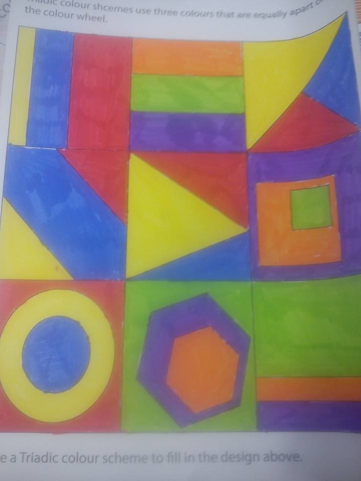
Exercise 2 was colour schemes, we had to use analogous, complementary and triadic colour schemes to colour in the words.


Ideas Generation.
Exercise 1 was to draw various different uses for a clothes peg, for example making the peg into a crocodile. Improving this drawing would mean that I should be more creative with the peg, making more animals with it and using more than one peg for the drawings.

Visual Communication
Exercise 1 was to draw a how-to-guide, step by step, to do or make something. Mine was a fly trap and we had to do it purely through visual steps with no words.

Objects
Exercise 1 was to study various paper tones, we had to draw a piece of paper in different forms; in a knot, twisted, curled and folded. To improve this drawing I could have made some of the individual drawings bigger so you can see more detail.

Textures
Exercise 1 was to use oil, soft and charcoal pastels to show different textures of materials, these materials were drawn from direct observation. I could have used a variety of pastels so the textures and drawings are more clear.

Subscribe to:
Comments (Atom)